A well-crafted typeface can communicate a message before someone even reads a single letter. Typography is the science of how fonts affect mood and emotion, which is why it’s an important tool for marketers and designers. By understanding how typography can be used to create specific emotions, you can use it to your advantage to create more effective marketing materials and designs. In this post, we’ll explore some key findings from studies on typography and mood and discuss how you can apply them to your work. Stay tuned!
The psychology of typography: how typefaces affect your mood
“When we see words, our brain automatically starts to process the meaning of those words,” explains Dr. David Lewis, a cognitive neuropsychologist. “And how those words look can significantly impact how easily – or how difficult – it is for us to understand what they mean.”

In other words, typography affects our mood. And while you might not think much about the font choice of your next blog post or the spacing of your next email campaign, the subtle (and not-so-subtle) ways that typefaces influence our emotions is something that designers think about all the time.
“Every typeface has its personality,” says graphic designer Ellen Lupton in her book Thinking with Type. “Some types look serious, while others look friendly. Some have tiny details that give them an energetic quality, while others are so simplified that they appear serene.”
So what does all of this mean for you? Well, the next time you choose a typeface for a project, think about the mood you want to evoke and choose accordingly. If you want your audience to feel energized and motivated, go with a typeface with many personalities. If you want them to feel calm and relaxed, go with something more serene.
And if you’re not sure where to start, here are some of our favorite typefaces for evoking different emotions:
- For happiness and energy: Playfair Display, Bebas Neue, Lobster
- For relaxation and calm: Lato, Open Sans, Roboto
- For sophistication and authority: Merriweather, Droid Serif, Georgia
What typefaces do you find yourself using most often? Let us know in the comments!

The role of typography in human emotion
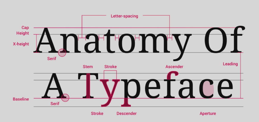
The basic purpose of typography is to communicate a message effectively and appealingly. In print media, typographers are responsible for the page’s overall design, including layout, margins, kerning, line spacing, and leading. They also select the typefaces used in a publication. Typographers must understand the communicative function of type to use it effectively. They must also have a keen eye for detail and an understanding of the aesthetic effects achieved through typographic choices.
The history of human emotion is closely linked to the history of typography. In ancient times, emotions were conveyed through pictures and symbols. The invention of writing and printing changed everything, making it possible to communicate emotions through words and text. Today, we rely on typography to express our emotions in digital and print media.
Just as different colors can evoke different emotions, so too can different typefaces. The choice of typeface is an important aspect of typographic design, and it can profoundly impact how a message is received. For example, a playful typeface might convey a light-hearted message, while a more serious typeface would be used for a more formal or somber message.
The use of color in typography can also be used to convey emotion. For example, color can make text stand out or blend it into the background. It can also be used to create a mood or feeling, such as using warm colors to create a feeling of happiness or cool colors to create a feeling of calmness.


